
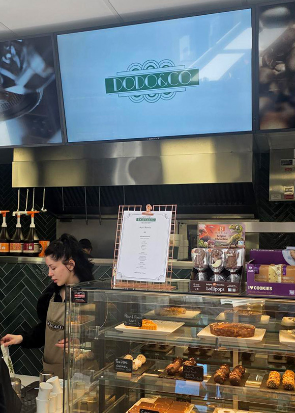
A new client came to us with a coffee shop that didn’t exist yet. It was part of the wider Newcastle Service Station development, and the site was still in early planning and construction. We had to build a coffee brand that felt like it belonged there before there was a “there” to belong to.
Everything came from the ground up: naming, visual direction, logo design, final brand development. This is the kind of work we take on as a branding agency in Ireland.
Make it feel like the place. And build it so it still works in five years, not just at launch.
The brand needed to:
Next: the name. We explored several directions before running each one through checks across:
No point falling in love with a name you can’t own. Those checks meant whatever we chose could be protected and built on properly.
Feedback and refinement narrowed it to a shortlist: the strongest options, and the ones the client actually connected with.
We started on site. Walked the location, stood in the space, got a feel for the environment, because you can’t design an atmosphere you’ve never been in. That visit shaped the early creative direction more than any brief document would have.
The first conversations covered:
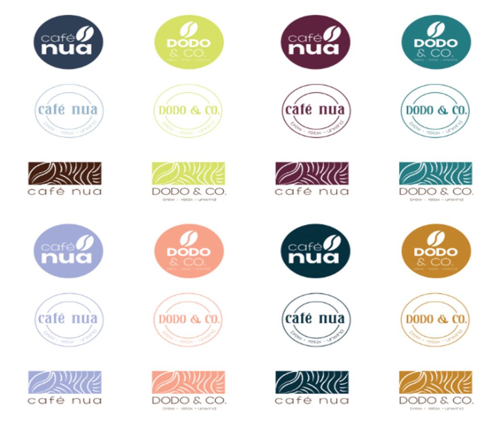
Once a direction started to emerge, early logo concepts went through several rounds of exploration: wide first, then narrow, then one mark.
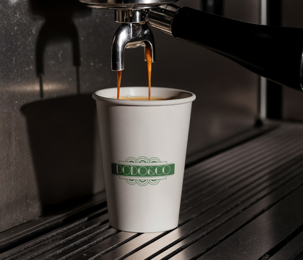
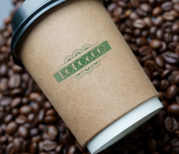
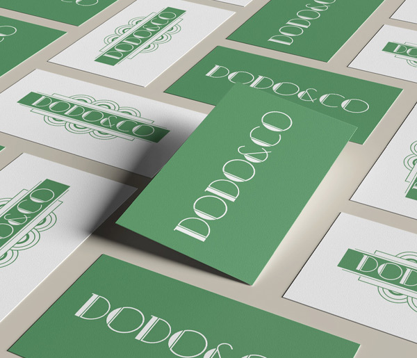
The brand landed on DODO&CO.
“Dodo” came from the client’s grandmother, a family name tied to the original cottage that stood on the site before redevelopment. “&CO” was added to widen it out, to say community rather than just one person.
Conversations with the client and their family pushed the direction further as we went, and the work moved toward an Art Deco-inspired aesthetic. That brought:
It’s a long way from where the early concepts sat. It’s also a much better brand, which is usually how coffee shop logo design projects go.
Clean, modern, and it means something. Personal storytelling doing the heavy lifting underneath strong visual design.
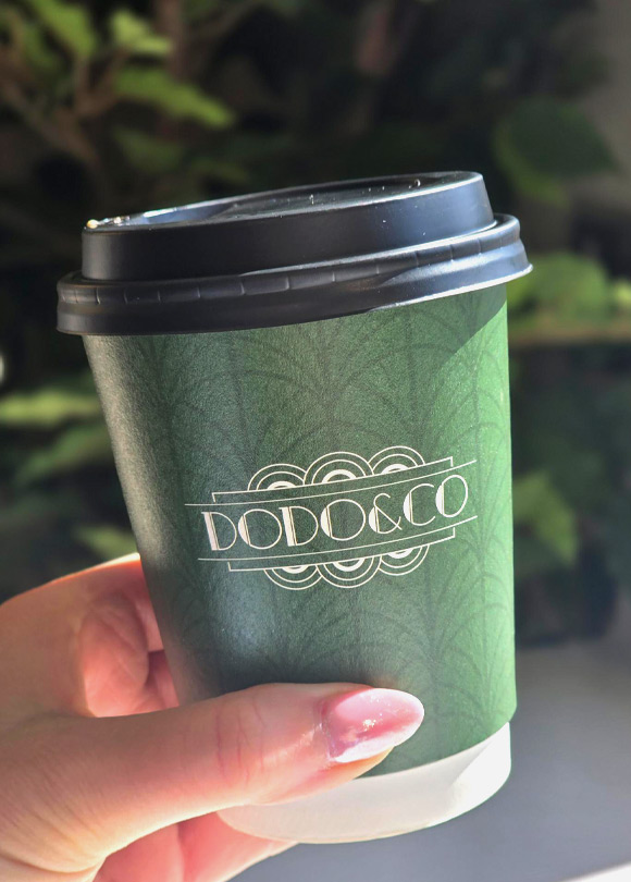
The branding was built to hold up everywhere customers meet it:
– Exterior signage
– Packaging
– Social media
– In-store applications
– Marketing materials
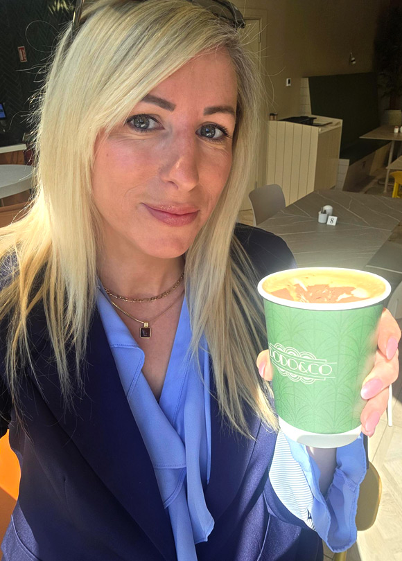
DODO&CO now has a brand presence people recognise, and it stays consistent whether you’re standing outside the building or scrolling past it on your phone.
We’re a creative agency in Ireland building brand identities from nothing: naming, logo design in Dublin, packaging, signage, the lot. If you’re opening something and you want it to look like it was always meant to be there, get in touch. Tell us what you’re building and we’ll tell you what it should look like.